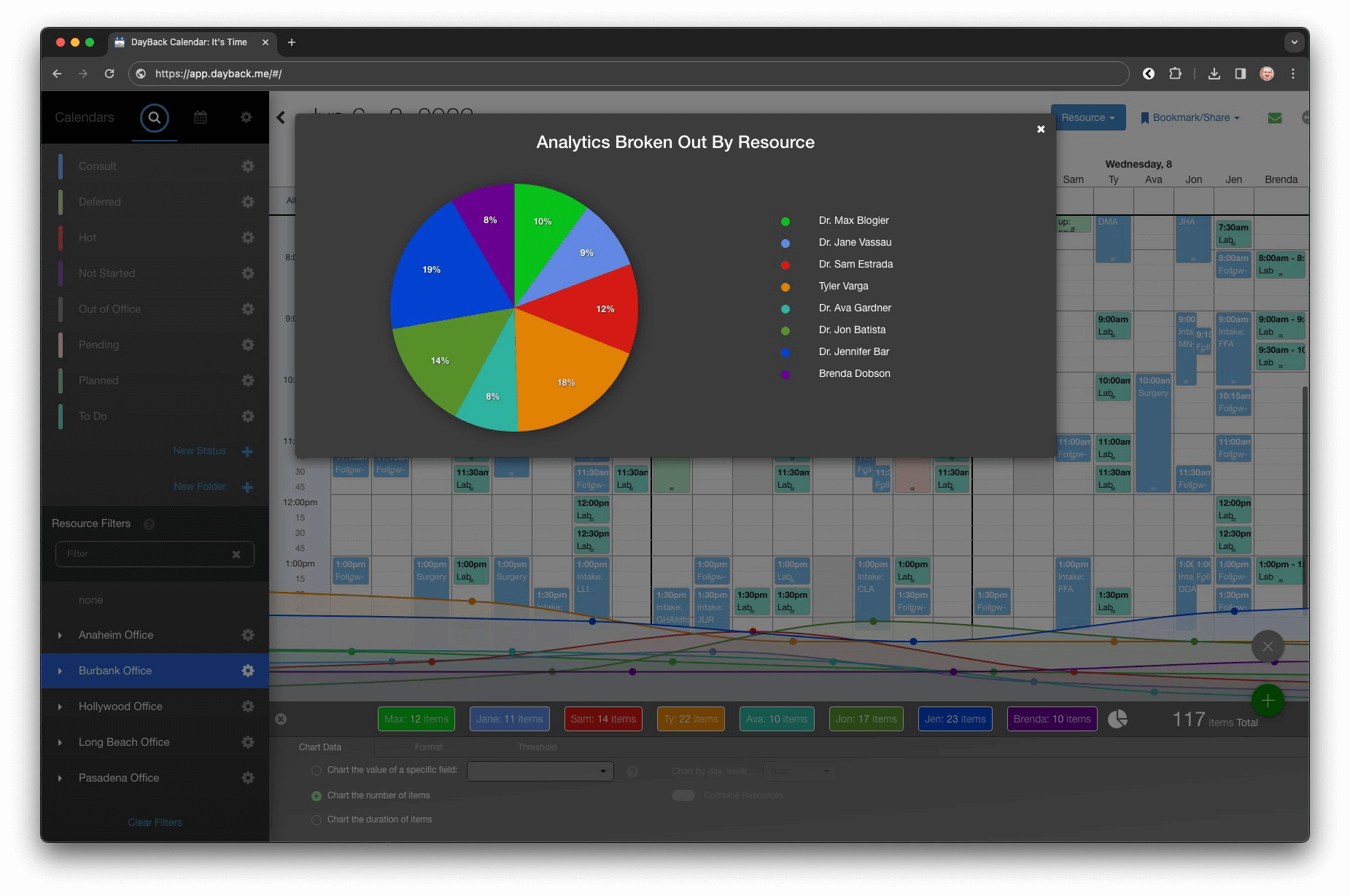
Gabi has published her first extension for DayBack and it’s sweet: you can now visualize your calendar analytics as a pie chart. This is ideal for comparing the relative weight of different resources, statuses, or anything you’re using to breakout your calendar.
Check it out here: https://dayback.com/listing/add-pie-chart-function-to-calendar-analytics/